Product / UX-UI · 2025
JustiFácil.
Justice in plain language
A heuristic evaluation, a redesign proposal and validation with real citizens for the platform that brings together the justice services of Colombia's executive branch, so anyone can use it without legal knowledge.
- Role
- Senior UX/UI Designer · Freelance · Team of 3 (with a PM and a lawyer)
- Client
- Colombia's Ministry of Justice · with Universidad de Los Andes
- Year
- 2025
- Tools
- Figma, Heuristic evaluation, Generative workshops, Usability testing, WCAG
- 012 workshops with citizens and partners
- 0210 usability tasks on the existing flows
- 03A citizen experience model with 6 principles
Context
JustiFácil is the platform Colombia’s Ministry of Justice is building to bring together, in one place, the services of executive-branch entities with judicial functions, in language anyone can understand, with or without legal knowledge.
The flows, wireframes and visual design already existed. My job was to review them, propose a redesign and validate the existing flows with real citizens, so the proposal answered what was actually hard for them.
My role
Senior UX/UI Designer, freelance, in a team of three: me on design, a project manager aligning the Ministry’s teams, and a lawyer checking that every plain-language text stayed legally correct.
- Heuristic evaluation of the existing platform.
- Redesign proposal based on that evaluation.
- User validation of the existing flows, to confirm and adjust the proposal.
How we did it
Heuristic evaluation. I reviewed the platform against usability heuristics and an accessibility checklist. That gave us the problems to solve and the first version of the proposal.
Workshop 1: the legal service experience. Grounded in legal service design and plain language:
- Value proposition map: people’s jobs, pains and gains when going through a digital legal process.
- Legal understanding: defining legal concepts in their own words, sorting them by stage of the process, rating how confident they felt, and judging whether the platform’s definitions helped.
Workshop 2: the user experience. A usability test with 10 tasks on the existing flows, a perception survey and an accessibility review against WCAG.
What we found
- Terms like “summons by publication” or “precautionary measure” weren’t understood, and people explained them in everyday words.
- People mixed up which stage of the process each term belongs to: they needed to see the whole process.
- Confidence varied even when answers were right, so the platform had to reassure people at every step.
- The interactive guide went unnoticed because of where it sat, and there was friction with icons, the glossary and alerts. The case table did work: everyone who reached that task found their case file.
The proposal
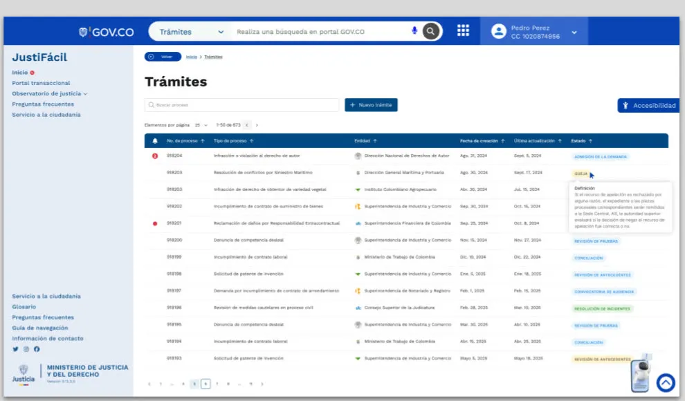
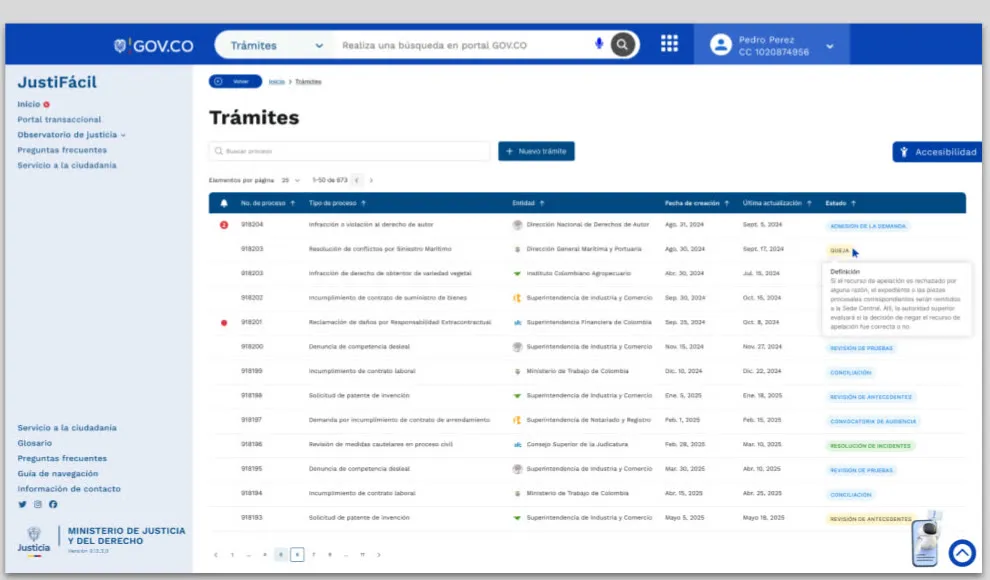
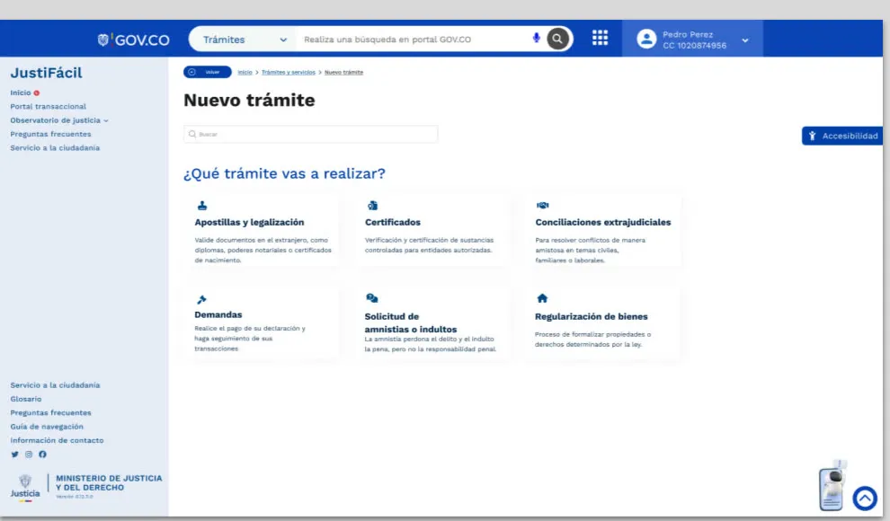
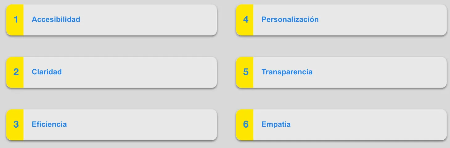
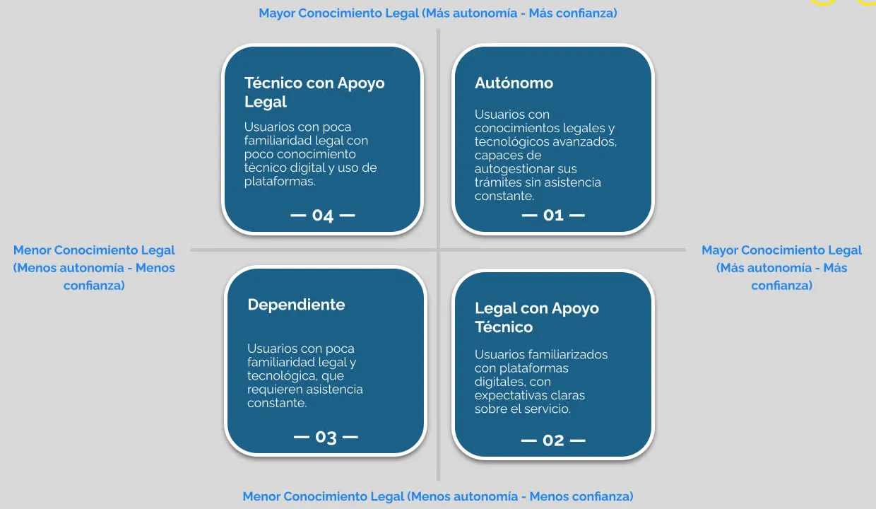
Beyond the screens, we proposed a citizen experience model with six principles (accessibility, clarity, efficiency, personalization, transparency and empathy) and profiles based on how much people know about law and technology.
Key decisions
Plain language, without losing legal certainty
We ruled out replacing legal terms entirely.
Why the procedures still had to be legally correct. The answer was to pair each term with a simple version and a practical example.
Profile by knowledge, not just demographics
We ruled out user profiles based only on demographic data.
Why what defines how autonomous and confident someone feels is how much they know about law and technology. Those two axes produced four profiles, from fully autonomous to those who need support.
Keep the GOV.CO header
We ruled out redesigning the platform header.
Why it’s the Colombian government standard and people already recognize it. Better to optimize the content space and navigation.
The project images are in Spanish, like the platform.